What Makes a Good Homepage for a Service-Based Business
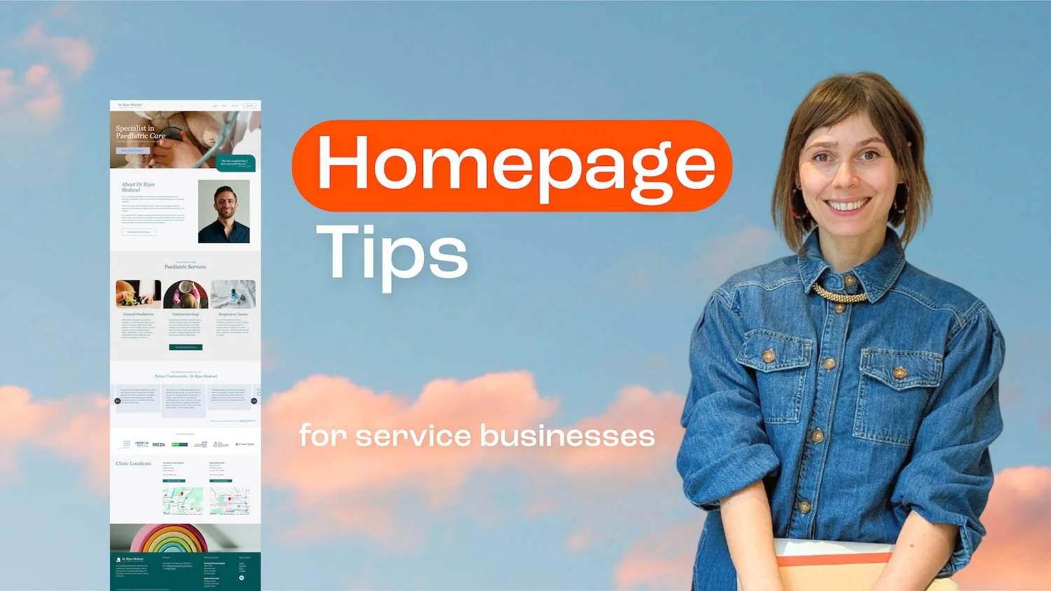
Let’s be honest, designing a homepage is tough.
It has a big job to do… tiiiiiny amount of time to do it.
I feel you, homepage.
Your homepage is usually the first thing people see when they land on your website, and people form an impression fast - often before they’ve read a single word.
That may sound brutal, but it’s actually quite helpful. It means your homepage doesn’t need to say and do everything - it just needs to say the right things, clearly and quickly.
Think of it less like a full brochure and more like a friendly introduction.
What is the main job of a homepage?
If you strip it right back, a good homepage should:
Reassure the right people they’re in the right place
Give them enough clarity and confidence to keep going
Guide them towards to the next step
That’s it.
Whether that next step is an enquiry, a booking, a purchase, or a deeper browse through your site, your homepage should make it easy to move forward.
Everything on the page should quietly support that journey, rather than slow it down or distract from it.
What to include on your homepage
Jump to…
1. A clear hero
Your hero section is the first thing people see - it’s the bit “above the fold” before they start scrolling - and it needs to work hard.
Within a few seconds, someone should be able to quickly understand your core proposition:
What you do
Who you help
Why it matters
Not in a vague, “elevating your digital presence” kind of way, but in plain English. This is your Ronseal moment. For service-based businesses, clarity beats cleverness every time.
For example, a practitioner might use a headline like:
Holistic acupuncture for busy professionals tired of running on empty.
Then a supporting subheading could add:
Gentle, personalised treatments designed to support pain relief, stress management, and long-term wellbeing.
This combination works because it immediately tells people they’re in the right place, while giving them a reason to keep scrolling and learn more.
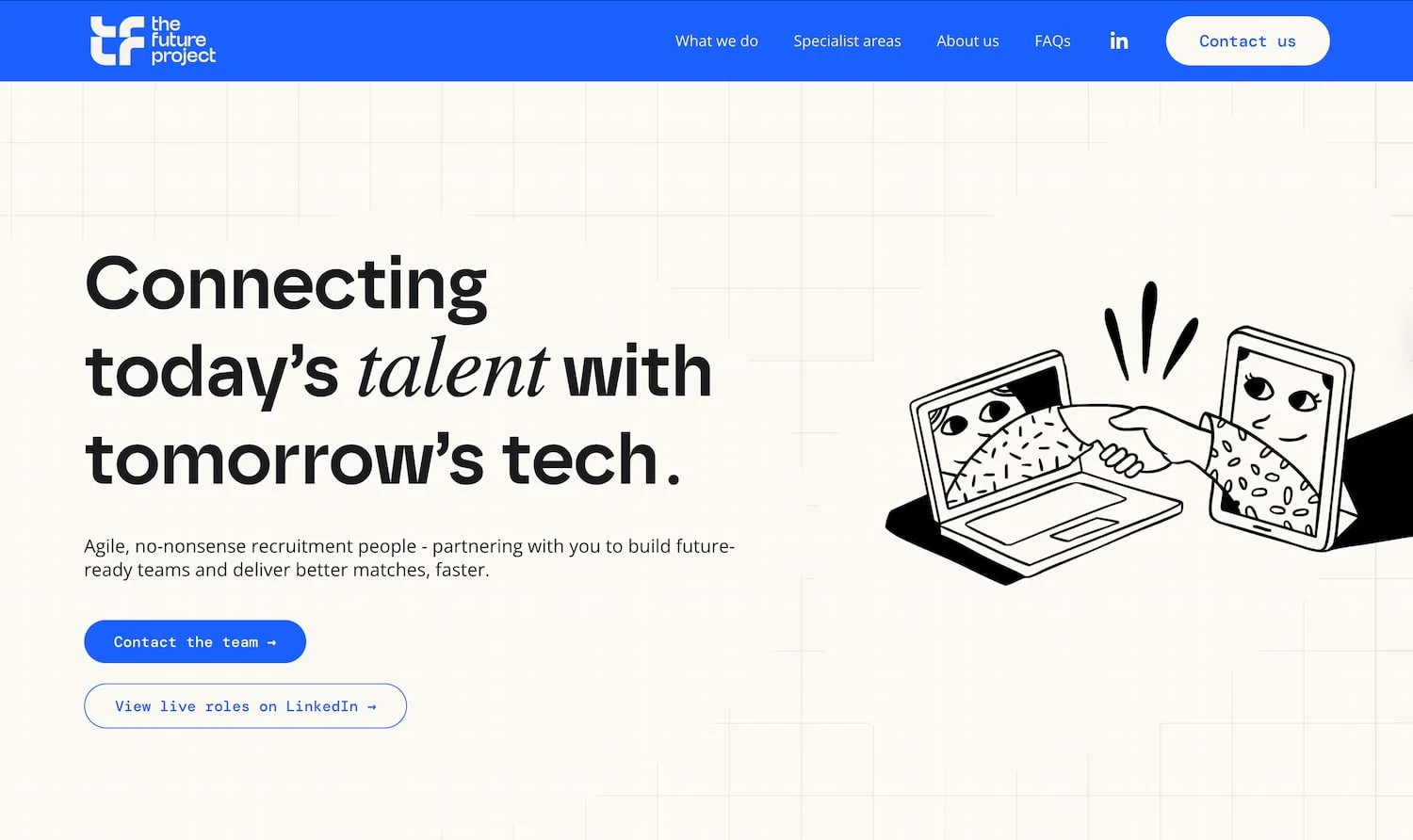
Hero section for tech recruitment agency The Future Project
Your hero checklist:
a clear headline
a supporting subheading
a primary Call-To-Action (CTA)
an engaging image, illustration or video that supports the messaging
maybe a small trust signal such as a short testimonial or rating
2. Services or Offer Section
This is where a short, easy-to-scan section comes in. You don’t need to list everything, just your core offers at a high-level, ideally with links through to each service page for more detail.
For example, a photographer might include:
Branding photography
Personal brand shoots
Event coverage
A therapist might include:
Family counselling
Couples therapy
Child and adolescent
The point is - make it easy for someone to scan the page and quickly spot the right solution for them.
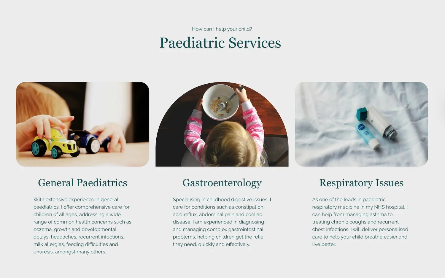
Services section for paediatrician in private practice, Dr Bijan Shahard
3. About Section
The about section on your homepage is not the place for a full biography. It should just be a snapshot - enough to give people a sense of who’s behind the business.
A little blurb about who you are, how you work, and what makes your approach different, to go alongside a welcoming pic of you in a relevant professional context (or at least, not an unrelated one!).
Just keep it warm, concise, and focused on what will build trust.
Then link through to your about page where they can find out more about you, your experience and credentials.
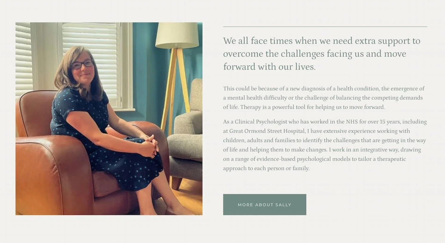
About section for clinical psychologist, Sally Pugh
4. Proof that you’re trustworthy
People don’t just want to know what you do, they want to feel confident choosing you.
That’s where social proof comes in.
This could look like:
Testimonials
Logo carousel showing clients you’ve worked with
Client projects
Short case-study snippets
You don’t need lots - even a single strong testimonial can make a big difference. This is especially true for service-based businesses, because the decision to buy is often based on trust as much as skill.
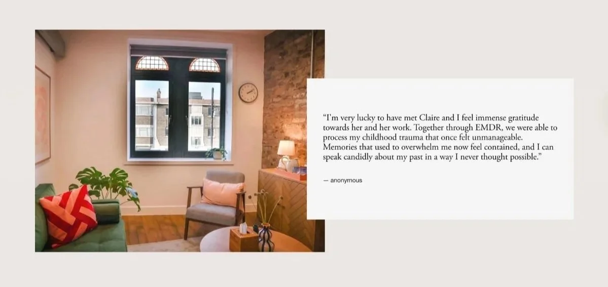
Testimonial section from South London Psychology
5. A clear way to get in touch
Once someone feels reassured by your services and social proof, don’t leave them guessing what happens next.
Make the next step simple, visible, and low-pressure.
For service-based businesses, this often works best as a clear invitation rather than a hard sell. For example:
Book a free 15-minute consultation
Make an enquiry
Get in touch to ask a question
Check availability
If you have a physical location, or work within a specific area, make this even clearer. People want to know where you are, whether you serve them, and how easy it is to start.
The key is to remove friction. If someone is ready to reach out, they shouldn’t have to hunt for a contact form or wonder what happens after they click.

Contact section for dyslexia assessor, Saadia Ali, from Beyond Barriers
6. A few extra things (only if they genuinely help)
Once the core structure is in place, you can add a few extras.
These might include:
a newsletter signup - great if you actually send useful updates, tips, or insights your audience would care about. If it exists purely as a box-ticking exercise it’s probably better left off.
a simple lead magnet -e.g. a free guide or checklist that helps your ideal client take a first step.
a social media feed - this can work if you’re active and genuinely helpful on social, as it can add personality and social proof.
BUT, embedded feeds often distract more than they help, and can pull people away from the main goal of your homepage. If you do include one, keep it small, intentional, and always secondary to your core message and buttons.
The key rule here; less is usually more.
Every section on your homepage should earn its place. If something doesn’t help someone understand what you do, trust you, or take the next step - it’s probably just noise.
Best-practice principles
Tone of voice, layout, spacing, and structure - every detail shapes how someone feels when they land on your site and what they understand about your business.
Key principles:
Sounds human and authentic
Make it easy to navigate, without too many menu options or competing buttons
Use real photography that connects with your audience
Use clear heading structure (one H1 per page), spacing and layout to guide the eye
Ensure it looks and works great on mobile, not just desktop
Keep it clear and uncluttered
Make the next step obvious with clear CTAs
Bringing it all together
A good homepage isn’t about saying more, it’s about focusing on saying the right things.
If someone lands on your site and instantly thinks “yes, this is for me” and knows what to do next, you’ve done the hard part right.
If you already have a website and want to sense-check that your own homepage isn’t turning people off, read what most service business homepages get wrong (and how to fix yours). And, if you need a hand sprucing up your website, have a look through ways I can help with Squarespace website support.